hello monday
Some design items to make your office awesome.
Have a great week. xx Pris
Kaleido Trays by Clara von Zweigbergk for HAY. Yesterday we received these as a gift. So wonderful!
eames
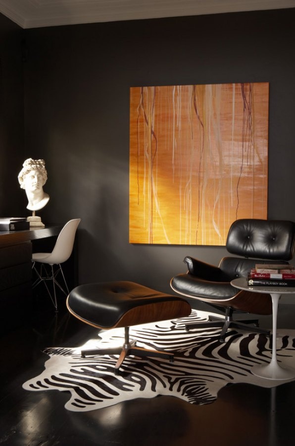
If there is one piece of furniture I one day hope to own (savings plan is in full force) it is a Eames Lounge chair and ottoman. I find this set incredible chic; its history, the story of the designers, the look and the comfort. I can already picture myself reading the latest Kinfolk issue while the sun sets and the Caribbean breeze flows slightly through my house.
“In continuous production since its introduction in 1956, the Eames Lounge Chair is widely considered one of the most significant designs of the 20th century.”
Image via Pinterest
It was the culmination of Charles and Ray Eameses' efforts to create a club chair using the molded plywood technology that they pioneered in the '40s. In Charles Eames' words, the vision was a chair with the "warm, receptive look of a well-used first baseman's mitt." (more via here)
Image via Pinterest
A timeless design, it's constructed to last lifetimes: Entirely hand-assembled, all parts are replaceable by Herman Miller. (more via here)
The husband and wife team (often mistaken for brothers) are best known for their groundbreaking contributions to architecture, furniture design, industrial design and manufacturing, and the photographic art.
Charles, an architect and Ray, a painter, married in 1941 and moved to California where they continued their furniture design work with moulding plywood.
In 1948, Herman Miller began producing the Eameses’ moulded plywood furniture. Their moulded plywood chair (DCM) is considered the best design of the 20th century. Herman Miller, Inc., continues to produce the Eameses iconic furniture today.(All via Living Edge)
Image via Pinterest
“Lean and modern. Playful and functional. Sleek, sophisticated, and beautifully simple. That was and is the “Eames look.”
Image via Pinterest
nordic house
Nordic House is a dry-cleaning shop in San Francisco, California. Anagrama approach to Nordic House’s branding was focused on Scandinavian design, combining simple geometric forms with a clean, sharp, well-distributed logotype and an icy, cold color palette. Snowy white, chilly grey, pine needle green and fresh salmon combine to create a cool Nordic landscape complete with its pure, immaculate and undisguised scents. A few icons are present in the overall identity, designed with a stark and reductionist style that captures the brand’s elemental emphasis on honesty, clarity and above all, quality. (more via here ).
I came across this on the Blog of Sarah Klassen for the first time and was instantly attracted to it. I love these simple, sleek and pure designs. I have never come across a dry-cleaning with such design thinking behind it. If this much detail went into planning the branding of Nordic House imagine the care they will take of your previous wardrobe. (I am a huge fan of dry-cleaning as you might imagine).


